Evaluation : History Log Terminal Analysis
Evaluation
Clustering
Clustering is one of the most common exploratory data analysis technique used to get an intuition about the structure of the data. It can be defined as the task of identifying subgroups in the data such that data points in the same subgroup (cluster) are very similar while data points in different clusters are very different. In other words, we try to find homogeneous subgroups within the data such that data points in each cluster are as similar as possible according to a similarity
K Means Algorithm
K Means algorithm is an iterative algorithm that tries to partition the dataset into Kpre-defined distinct non-overlapping subgroups (clusters) where each data point belongs to only one group. It tries to make the intra-cluster data points as similar as possible while also keeping the clusters as different (far) as possible. It assigns data points to a cluster such that the sum of the squared distance between the data points and the cluster’s centroid (arithmetic mean of all the data points that belong to that cluster) is at the minimum. The less variation we have within clusters, the more homogeneous (similar) the data points are within the same cluster.
The way k means algorithm works is as follows:
- Specify number of clusters K.
- Initialize centroids by first shuffling the dataset and then randomly selecting K data points for the centroids without replacement.
- Keep iterating until there is no change to the centroids. i.e assignment of data points to clusters isn’t changing.
- Compute the sum of the squared distance between data points and all centroids.
- Assign each data point to the closest cluster (centroid).
- Compute the centroids for the clusters by taking the average of the all data points that belong to each cluster.
Evaluation Methods
Contrary to supervised learning where we have the ground truth to evaluate the model’s performance, clustering analysis doesn’t have a solid evaluation metric that we can use to evaluate the outcome of different clustering algorithms.
Elbow Method
Elbow method gives us an idea on what a good k number of clusters would be based on the sum of squared distance (SSE) between data points and their assigned clusters’ centroids. We pick k at the spot where SSE starts to flatten out and forming an elbow. We’ll use the geyser dataset and evaluate SSE for different values of k and see where the curve might form an elbow and flatten out.
# Run the Kmeans algorithm and get the index of data points clusters
sse = []
list_k = list(range(1, 10))

for k in list_k:
    km = KMeans(n_clusters=k)
    km.fit(X_std2)
    sse.append(km.inertia_)

# Plot sse against k
plt.figure(figsize=(6, 6))
plt.plot(list_k, sse, '-o')
plt.xlabel(r'Number of clusters *k*')
plt.ylabel('Sum of squared distance');
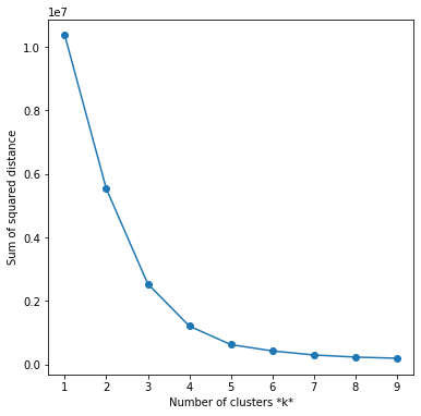
The graph above shows that k=5 is not a bad choice. Sometimes it’s still hard to figure out a good number of clusters to use because the curve is monotonically decreasing and may not show any elbow or has an obvious point where the curve starts flattening out.
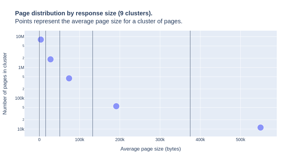
Visualize Cluster
import plotly.express as px
fig = px.scatter(cluster_df,
                 x='mean', y='count',
                 size=[5]*len(cluster_df),
                 size_max=15,
                 log_y=True,
                 hover_data=['min', 'max', 'std'],
                 title=f'<b>Page distribution by response size ({k} clusters).</b><br>Points represent the average page size for a cluster of pages.',
                 labels={'mean': 'Average page size (bytes)',
                         'count': "Number of pages in cluster"},
                )
fig.data[0].hovertemplate = '<b>Average page size (bytes): %{x:,.0f}</b><br><br>Number of pages in cluster: %{y:,.0f}<br><br>min: %{customdata[0]:,.0f}<br>max: %{customdata[1]:,.0f}<br>std: %{customdata[2]:,.0f}<extra></extra>'
for minimum in cluster_df['min']:
    fig.add_vline(x=minimum, line={'width': 1})
fig.layout.font.size = 14
fig.show()