Analysis London Crime dataset
Publication-grade Plot Introduction
The aim of this projects is to introduce you to data visualization with Python as concrete and as consistent as possible. Using what you’ve learned; download the London Crime Dataset from Kaggle. This dataset is a record of crime in major metropolitan areas, such as London, occurs in distinct patterns. This data covers the number of criminal reports by month, LSOA borough, and major/minor category from Jan 2008-Dec 2016.
This dataset contains:
lsoa_code: this represents a policing areaborough: the london borough for which the statistic is relatedmajor_category: the major crime categoryminor_category: the minor crime categoryvalue: the count of the crime for that particular borough, in that particular monthyear: the year of the summary statisticmonth: the month of the summary statistic
Formulate a question and derive a statistical hypothesis test to answer the question. You have to demonstrate that you’re able to make decisions using data in a scientific manner. And the important things, Visualized the data. Examples of questions can be:
- What is the change in the number of crime incidents from 2011 to 2016?
- What were the top 3 crimes per borough in 2016?
Please make sure that you have completed the session for this course, namely Advanced Visualization which is part of this Program.
Note: You can take a look at Project Rubric below:
| Criteria | Meet Expectations | ||
|---|---|---|---|
| Area Plot | Mengimplementasikan Area Plot Menggunakan Matplotlib Dengan Data Yang Relevan Dan Sesuai Dengan Kegunaan Plot/Grafik |
||
| Histogram | Mengimplementasikan Histogram Menggunakan Matplotlib Dengan Data Yang Relevan Dan Sesuai Dengan Kegunaan Plot/Grafik. |
||
| Bar Chart | Mengimplementasikan Bar Chart Menggunakan Matplotlib Dengan Data Yang Relevan Dan Sesuai Dengan Kegunaan Plot/Grafik. |
||
| Pie Chart | Mengimplementasikan Pie Chart Menggunakan Matplotlib Dengan Data Yang Relevan Dan Sesuai Dengan Kegunaan Plot/Grafik. |
||
| Box Plot | Mengimplementasikan Box Plot Menggunakan Matplotlib Dengan Data Yang Relevan Dan Sesuai Dengan Kegunaan Plot/Grafik. |
||
| Scatter Plot | Mengimplementasikan Scatter Plot Menggunakan Matplotlib Dengan Data Yang Relevan Dan Sesuai Dengan Kegunaan Plot/Grafik. |
||
| Word Clouds | Mengimplementasikan Word Clouds Menggunakan Wordclouds Library Dengan Data Yang Relevan Dan Sesuai Dengan Kegunaan Plot/Grafik. |
||
| Folium Maps | Mengimplementasikan London Maps Menggunakan Folium. |
||
| Preprocessing | Student Melakukan Preproses Dataset Sebelum Menerapkan Visualisasi. | Apakah Kode Berjalan Tanpa Ada Eror? | |
| Apakah Kode Berjalan Tanpa Ada Eror? | Seluruh Kode Berfungsi Dan Dibuat Dengan Benar. | ||
| Area Plot | Menarik Informasi/Kesimpulan Berdasarkan Area Plot Yang Telah Student Buat | ||
| Histogram | Menarik Informasi/Kesimpulan Berdasarkan Histogram Yang Telah Student Buat | ||
| Bar Chart | Menarik Informasi/Kesimpulan Berdasarkan Bar Chart Yang Telah Student Buat | ||
| Pie Chart | Menarik Informasi/Kesimpulan Berdasarkan Pie Chart Yang Telah Student Buat | ||
| Box Plot | Menarik Informasi/Kesimpulan Berdasarkan Box Plot Yang Telah Student Buat | ||
| Scatter Plot | Menarik Informasi/Kesimpulan Berdasarkan Scatter Plot Yang Telah Student Buat | ||
| Overall Analysis | Menarik Informasi/Kesimpulan Dari Keseluruhan Plot Yang Dapat Menjawab Hipotesis. |
Focus on “Graded-Function” sections.
Exploring Datasets with pandas
pandas is an essential data analysis toolkit for Python. From their website:
pandas is a Python package providing fast, flexible, and expressive data structures designed to make working with “relational” or “labeled” data both easy and intuitive. It aims to be the fundamental high-level building block for doing practical, real world data analysis in Python.
The course heavily relies on pandas for data wrangling, analysis, and visualization. We encourage you to spend some time and familizare yourself with the pandas API Reference: http://pandas.pydata.org/pandas-docs/stable/api.html.
The first thing we’ll do is import two key data analysis modules: pandas and Numpy.
import numpy as np
import pandas as pd
df = pd.read_csv('london_crime_by_lsoa.csv')

print ('Data read into a pandas dataframe!')
Data read into a pandas dataframe!
# Let's view the top 5 rows of the dataset using the head() function.
df.head()
| lsoa_code | borough | major_category | minor_category | value | year | month | |
|---|---|---|---|---|---|---|---|
| 0 | E01001116 | Croydon | Burglary | Burglary in Other Buildings | 0 | 2016 | 11 |
| 1 | E01001646 | Greenwich | Violence Against the Person | Other violence | 0 | 2016 | 11 |
| 2 | E01000677 | Bromley | Violence Against the Person | Other violence | 0 | 2015 | 5 |
| 3 | E01003774 | Redbridge | Burglary | Burglary in Other Buildings | 0 | 2016 | 3 |
| 4 | E01004563 | Wandsworth | Robbery | Personal Property | 0 | 2008 | 6 |
# We can also veiw the bottom 5 rows of the dataset using the tail() function.
df.tail()
| lsoa_code | borough | major_category | minor_category | value | year | month | |
|---|---|---|---|---|---|---|---|
| 13490599 | E01000504 | Brent | Criminal Damage | Criminal Damage To Dwelling | 0 | 2015 | 2 |
| 13490600 | E01002504 | Hillingdon | Robbery | Personal Property | 1 | 2015 | 6 |
| 13490601 | E01004165 | Sutton | Burglary | Burglary in a Dwelling | 0 | 2011 | 2 |
| 13490602 | E01001134 | Croydon | Robbery | Business Property | 0 | 2011 | 5 |
| 13490603 | E01003413 | Merton | Violence Against the Person | Wounding/GBH | 0 | 2015 | 6 |
When analyzing a dataset, it’s always a good idea to start by getting basic information about your dataframe. We can do this by using the info() method.
print(df.info())
print(df.describe())
print('minor_category ',df.minor_category.unique())
print('major_category ',df.major_category.unique())
print('borough ',df.borough.unique())

print("To check if any colun has null values")
print(df.isnull().any())
<class 'pandas.core.frame.DataFrame'>
RangeIndex: 13490604 entries, 0 to 13490603
Data columns (total 7 columns):
 #   Column          Dtype
---  ------          -----
 0   lsoa_code       object
 1   borough         object
 2   major_category  object
 3   minor_category  object
 4   value           int64
 5   year            int64
 6   month           int64
dtypes: int64(3), object(4)
memory usage: 720.5+ MB
None
              value          year         month
count  1.349060e+07  1.349060e+07  1.349060e+07
mean   4.779444e-01  2.012000e+03  6.500000e+00
std    1.771513e+00  2.581989e+00  3.452053e+00
min    0.000000e+00  2.008000e+03  1.000000e+00
25%    0.000000e+00  2.010000e+03  3.750000e+00
50%    0.000000e+00  2.012000e+03  6.500000e+00
75%    1.000000e+00  2.014000e+03  9.250000e+00
max    3.090000e+02  2.016000e+03  1.200000e+01
minor_category  ['Burglary in Other Buildings' 'Other violence' 'Personal Property'
 'Other Theft' 'Offensive Weapon' 'Criminal Damage To Other Building'
 'Theft/Taking of Pedal Cycle' 'Motor Vehicle Interference & Tampering'
 'Theft/Taking Of Motor Vehicle' 'Wounding/GBH' 'Other Theft Person'
 'Common Assault' 'Theft From Shops' 'Possession Of Drugs' 'Harassment'
 'Handling Stolen Goods' 'Criminal Damage To Dwelling'
 'Burglary in a Dwelling' 'Criminal Damage To Motor Vehicle'
 'Other Criminal Damage' 'Counted per Victim' 'Going Equipped'
 'Other Fraud & Forgery' 'Assault with Injury' 'Drug Trafficking'
 'Other Drugs' 'Business Property' 'Other Notifiable' 'Other Sexual'
 'Theft From Motor Vehicle' 'Rape' 'Murder']
major_category  ['Burglary' 'Violence Against the Person' 'Robbery' 'Theft and Handling'
 'Criminal Damage' 'Drugs' 'Fraud or Forgery' 'Other Notifiable Offences'
 'Sexual Offences']
borough  ['Croydon' 'Greenwich' 'Bromley' 'Redbridge' 'Wandsworth' 'Ealing'
 'Hounslow' 'Newham' 'Sutton' 'Haringey' 'Lambeth' 'Richmond upon Thames'
 'Hillingdon' 'Havering' 'Barking and Dagenham' 'Kingston upon Thames'
 'Westminster' 'Hackney' 'Enfield' 'Harrow' 'Lewisham' 'Brent' 'Southwark'
 'Barnet' 'Waltham Forest' 'Camden' 'Bexley' 'Kensington and Chelsea'
 'Islington' 'Tower Hamlets' 'Hammersmith and Fulham' 'Merton'
 'City of London']
To check if any colun has null values
lsoa_code         False
borough           False
major_category    False
minor_category    False
value             False
year              False
month             False
dtype: bool
To get the list of column headers we can call upon the dataframe’s .columns parameter.
df.columns.values
array(['lsoa_code', 'borough', 'major_category', 'minor_category',
       'value', 'year', 'month'], dtype=object)
Similarly, to get the list of indicies we use the .index parameter.
df.index.values
array([ 0, 1, 2, ..., 13490601, 13490602, 13490603])
Rename column
df.rename(columns={'borough':'District'}, inplace=True)
df.head()
| lsoa_code | District | major_category | minor_category | value | year | month | |
|---|---|---|---|---|---|---|---|
| 0 | E01001116 | Croydon | Burglary | Burglary in Other Buildings | 0 | 2016 | 11 |
| 1 | E01001646 | Greenwich | Violence Against the Person | Other violence | 0 | 2016 | 11 |
| 2 | E01000677 | Bromley | Violence Against the Person | Other violence | 0 | 2015 | 5 |
| 3 | E01003774 | Redbridge | Burglary | Burglary in Other Buildings | 0 | 2016 | 3 |
| 4 | E01004563 | Wandsworth | Robbery | Personal Property | 0 | 2008 | 6 |
To view the dimensions of the dataframe, we use the .shape parameter.
print(df.shape)
(13490604, 7)
Let’s make one dataset that contains value 1 in value features.
criminal = df[df['value'] == 1]
df1 = df.copy()
df1.drop(['lsoa_code','minor_category'], axis=1, inplace=True)
df1
| District | major_category | value | year | month | |
|---|---|---|---|---|---|
| 0 | Croydon | Burglary | 0 | 2016 | 11 |
| 1 | Greenwich | Violence Against the Person | 0 | 2016 | 11 |
| 2 | Bromley | Violence Against the Person | 0 | 2015 | 5 |
| 3 | Redbridge | Burglary | 0 | 2016 | 3 |
| 4 | Wandsworth | Robbery | 0 | 2008 | 6 |
| ... | ... | ... | ... | ... | ... |
| 13490599 | Brent | Criminal Damage | 0 | 2015 | 2 |
| 13490600 | Hillingdon | Robbery | 1 | 2015 | 6 |
| 13490601 | Sutton | Burglary | 0 | 2011 | 2 |
| 13490602 | Croydon | Robbery | 0 | 2011 | 5 |
| 13490603 | Merton | Violence Against the Person | 0 | 2015 | 6 |
13490604 rows × 5 columns
drugs = df1[(df1['major_category'] == 'Drugs') & (df1['year'] == 2016)]
print(drugs.value.sum())
38914
df_sum = df1.groupby(['year','District']).size().reset_index(name='count_per_year')
print(df_sum)
print(df_sum.columns)
     year              District  count_per_year
0    2008  Barking and Dagenham           34560
1    2008                Barnet           63648
2    2008                Bexley           42852
3    2008                 Brent           54516
4    2008               Bromley           58212
..    ...                   ...             ...
292  2016                Sutton           35832
293  2016         Tower Hamlets           45792
294  2016        Waltham Forest           45144
295  2016            Wandsworth           55404
296  2016           Westminster           40740

[297 rows x 3 columns]
Index(['year', 'District', 'count_per_year'], dtype='object')
table = df1.pivot_table(values='value', index=['year'],columns=['major_category'], aggfunc=np.sum, fill_value=0)
table
| major_category | Burglary | Criminal Damage | Drugs | Fraud or Forgery | Other Notifiable Offences | Robbery | Sexual Offences | Theft and Handling | Violence Against the Person |
|---|---|---|---|---|---|---|---|---|---|
| year | |||||||||
| 2008 | 88092 | 91872 | 68804 | 5325 | 10112 | 29627 | 1273 | 283692 | 159844 |
| 2009 | 90619 | 85565 | 60549 | 0 | 10644 | 29568 | 0 | 279492 | 160777 |
| 2010 | 86826 | 77897 | 58674 | 0 | 10768 | 32341 | 0 | 290924 | 157894 |
| 2011 | 93315 | 70914 | 57550 | 0 | 10264 | 36679 | 0 | 309292 | 146901 |
| 2012 | 93392 | 62158 | 51776 | 0 | 10675 | 35260 | 0 | 334054 | 150014 |
| 2013 | 87222 | 56206 | 50278 | 0 | 10811 | 29337 | 0 | 306372 | 146181 |
| 2014 | 76053 | 59279 | 44435 | 0 | 13037 | 22150 | 0 | 279880 | 185349 |
| 2015 | 70489 | 62976 | 39785 | 0 | 14229 | 21383 | 0 | 284022 | 218740 |
| 2016 | 68285 | 64071 | 38914 | 0 | 15809 | 22528 | 0 | 294133 | 232381 |
Visualizing Data using Matplotlib
Matplotlib: Standard Python Visualization Library
The primary plotting library we will explore in the course is Matplotlib. As mentioned on their website:
Matplotlib is a Python 2D plotting library which produces publication quality figures in a variety of hardcopy formats and interactive environments across platforms. Matplotlib can be used in Python scripts, the Python and IPython shell, the jupyter notebook, web application servers, and four graphical user interface toolkits.
If you are aspiring to create impactful visualization with python, Matplotlib is an essential tool to have at your disposal.
Matplotlib.Pyplot
One of the core aspects of Matplotlib is matplotlib.pyplot.
Let’s start by importing Matplotlib and Matplotlib.pyplot as follows:
# we are using the inline backend
%matplotlib inline

import matplotlib as mpl
import matplotlib.pyplot as plt
mpl.style.use(['ggplot']) # optional: for ggplot-like style
Area Pots (Series/Dataframe)
What is a line plot and why use it?
An Area chart or area plot is a type of plot which displays information as a series of data points called ‘markers’ connected by straight line segments. It is a basic type of chart common in many fields. Use line plot when you have a continuous data set. These are best suited for trend-based visualizations of data over a period of time.
Questions:
- what most major_criminal in 2008-2016?
# Write your function below
table.plot(kind='area',
           alpha=0.45,
             stacked=False,
             figsize=(20, 10), # pass a tuple (x, y) size
             )
# Graded-Funtion Begin (~1 Lines)

# Graded-Funtion End

plt.title('Area Plot of major_criminal in 2008-2016') # add a title to the area plot
plt.ylabel('Number of accident') # add y-label
plt.xlabel('Year') # add x-label

plt.show()
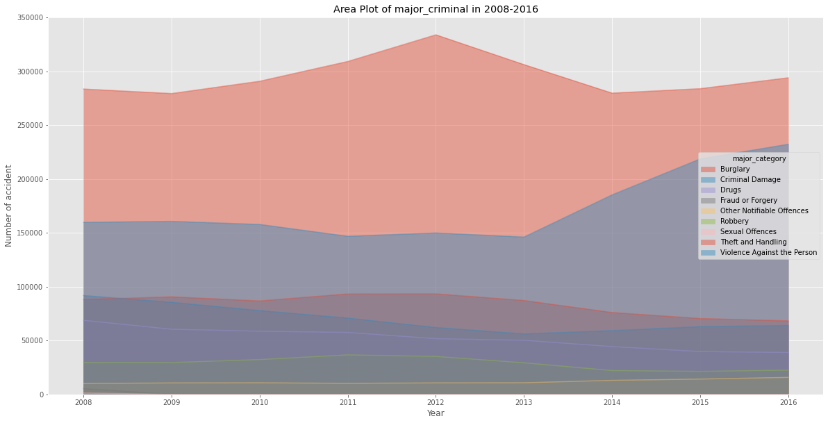
Insight:
Based on graph, Thef and Handling is most major criminal happend during 2008-2018
Histogram
A histogram is a way of representing the frequency distribution of numeric dataset. The way it works is it partitions the x-axis into bins, assigns each data point in our dataset to a bin, and then counts the number of data points that have been assigned to each bin. So the y-axis is the frequency or the number of data points in each bin. Note that we can change the bin size and usually one needs to tweak it so that the distribution is displayed nicely.
Question:
- Frequency major case criminal in London (Make your own questions)
# Write your function below
count, bin_edges = np.histogram(table, 15)
table.plot(kind ='hist',
          figsize=(15, 6),
          bins=15,
          alpha=0.6,
          xticks=bin_edges,
         )
# Graded-Funtion Begin (~2 Lines)

# Graded-Funtion End

plt.title('Histogram of major criminal in 2008-2016') # add a title to the histogram
plt.ylabel('Number of Years') # add y-label
plt.xlabel('Number of Criminal ') # add x-label

plt.show()
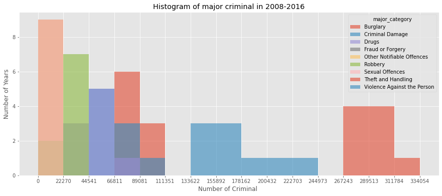
Insight: Most frequency cases in london between 2008-2016 is Thef and Handling (Make your own Insight)
Bar Charts (Dataframe)
A bar plot is a way of representing data where the length of the bars represents the magnitude/size of the feature/variable. Bar graphs usually represent numerical and categorical variables grouped in intervals.
To create a bar plot, we can pass one of two arguments via kind parameter in plot():
kind=barcreates a vertical bar plotkind=barhcreates a horizontal bar plot
Question:
- Yearly drug case in London from 2008-2016?
# Write your function below
table_bar = table['Drugs']
table_bar.plot(kind='bar', figsize=(10, 6))
# Graded-Funtion Begin (~1 Lines)

# Graded-Funtion End

plt.xlabel('Year') # add to x-label to the plot
plt.ylabel('Number of crime drugs') # add y-label to the plot
plt.title('London drugs case in 2008-2016') # add title to the plot

plt.show()
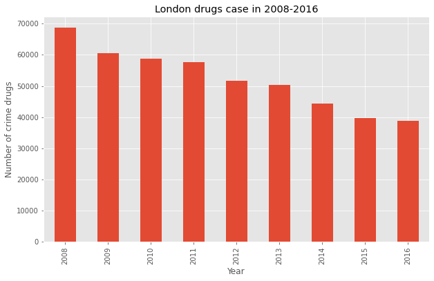
Insight:
Drug case in London is decrasing in 2008-2016
Pie Charts
A pie chart is a circualr graphic that displays numeric proportions by dividing a circle (or pie) into proportional slices. You are most likely already familiar with pie charts as it is widely used in business and media. We can create pie charts in Matplotlib by passing in the kind=pie keyword.
Question:
(Make your own questions)
table_pie = table.transpose()
table_pie['total'] = table.sum()
table_pie
| year | 2008 | 2009 | 2010 | 2011 | 2012 | 2013 | 2014 | 2015 | 2016 | total |
|---|---|---|---|---|---|---|---|---|---|---|
| major_category | ||||||||||
| Burglary | 88092 | 90619 | 86826 | 93315 | 93392 | 87222 | 76053 | 70489 | 68285 | 754293 |
| Criminal Damage | 91872 | 85565 | 77897 | 70914 | 62158 | 56206 | 59279 | 62976 | 64071 | 630938 |
| Drugs | 68804 | 60549 | 58674 | 57550 | 51776 | 50278 | 44435 | 39785 | 38914 | 470765 |
| Fraud or Forgery | 5325 | 0 | 0 | 0 | 0 | 0 | 0 | 0 | 0 | 5325 |
| Other Notifiable Offences | 10112 | 10644 | 10768 | 10264 | 10675 | 10811 | 13037 | 14229 | 15809 | 106349 |
| Robbery | 29627 | 29568 | 32341 | 36679 | 35260 | 29337 | 22150 | 21383 | 22528 | 258873 |
| Sexual Offences | 1273 | 0 | 0 | 0 | 0 | 0 | 0 | 0 | 0 | 1273 |
| Theft and Handling | 283692 | 279492 | 290924 | 309292 | 334054 | 306372 | 279880 | 284022 | 294133 | 2661861 |
| Violence Against the Person | 159844 | 160777 | 157894 | 146901 | 150014 | 146181 | 185349 | 218740 | 232381 | 1558081 |
# Write your function below

# ratio for each continent with which to offset each wedge.
colors_list = ['gold', 'yellowgreen', 'lightcoral', 'lightskyblue', 'lightgreen', 'pink','red','purple','brown']
explode_list = [0.1, 0, 0, 0, 0, 0, 0, 0.1, 0.1]

# Graded-Funtion Begin (~8 Lines)
table_pie['total'].plot(kind='pie',
                      figsize=(15, 6),
                      autopct='%1.1f%%',
                      startangle=90,
                      shadow=True,
                      labels=None,         # turn off labels on pie chart
                      colors=colors_list,  # add custom colors
                      # the ratio between the center of each pie slice and the start of the text generated by autopct
                      pctdistance=1.12,
                      explode=explode_list  # 'explode'
                      )
# Graded-Funtion End

# scale the title up by 12% to match pctdistance
plt.title('Major criminal case in London (2008-2016)', y=1.12)

plt.axis('equal')

# add legend
plt.legend(labels=table_pie.index, loc='upper left')

plt.show()
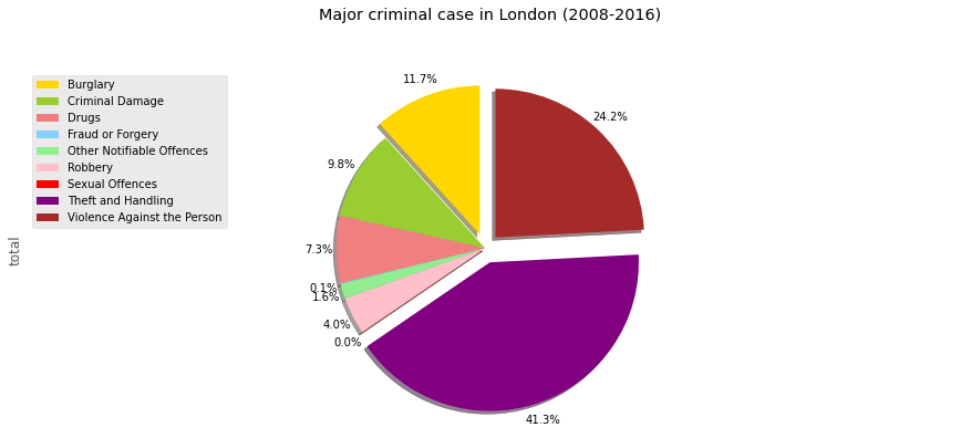
Insight:
Theft and Handling is most major criminal case in London during 2008-2016, with precentage is 41,3%
Box Plots
A box plot is a way of statistically representing the distribution of the data through five main dimensions:
- Minimun: Smallest number in the dataset.
- First quartile: Middle number between the
minimumand themedian. - Second quartile (Median): Middle number of the (sorted) dataset.
- Third quartile: Middle number between
medianandmaximum. - Maximum: Highest number in the dataset.
Question:
- Describe drug case in London from 2008-2016? (Make your own questions)
# Write your function below
table_bar.plot(kind='box', figsize=(8, 6))
# Graded-Funtion Begin (~1 Lines)

# Graded-Funtion End

plt.title('Box plot of drugs case in London from 1980 - 2013')
plt.ylabel('Number of cases')

plt.show()
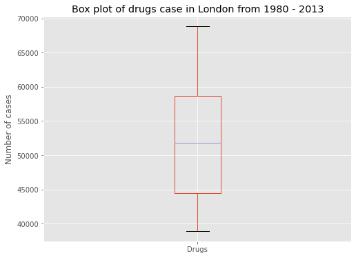
Insight: Drugs max cases is around 70000 cases (Make your own Insight)
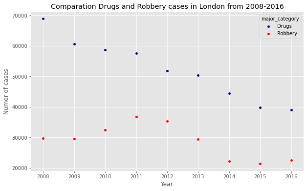
Scatter Plots
A scatter plot (2D) is a useful method of comparing variables against each other. Scatter plots look similar to line plots in that they both map independent and dependent variables on a 2D graph. While the datapoints are connected together by a line in a line plot, they are not connected in a scatter plot. The data in a scatter plot is considered to express a trend. With further analysis using tools like regression, we can mathematically calculate this relationship and use it to predict trends outside the dataset.
Question:
- lets compare Drugs and Robbery
(Make your own questions)
table_scatter = table[['Drugs','Robbery']]
table_scatter = table_scatter.reset_index()
table_scatter
| major_category | year | Drugs | Robbery |
|---|---|---|---|
| 0 | 2008 | 68804 | 29627 |
| 1 | 2009 | 60549 | 29568 |
| 2 | 2010 | 58674 | 32341 |
| 3 | 2011 | 57550 | 36679 |
| 4 | 2012 | 51776 | 35260 |
| 5 | 2013 | 50278 | 29337 |
| 6 | 2014 | 44435 | 22150 |
| 7 | 2015 | 39785 | 21383 |
| 8 | 2016 | 38914 | 22528 |
# Write your function below

# Graded-Funtion Begin (~1 Lines)
ax1 = table_scatter.plot(kind='scatter', x='year', y='Drugs', figsize=(10, 6), color='darkblue', label='Drugs')
ax2 = table_scatter.plot(kind='scatter', x='year', y='Robbery', figsize=(10, 6), color='red',label='Robbery', ax=ax1 )

# Graded-Funtion End

plt.title('Comparation Drugs and Robbery cases in London from 2008-2016')
plt.xlabel('Year')
plt.ylabel('Numer of cases')
plt.show()
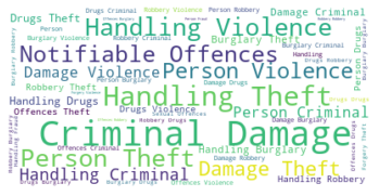
Word Clouds
Word clouds (also known as text clouds or tag clouds) work in a simple way: the more a specific word appears in a source of textual data (such as a speech, blog post, or database), the bigger and bolder it appears in the word cloud.
# install wordcloud
# !conda install -c conda-forge wordcloud --yes

# !pip install wordcloud

# import package and its set of stopwords
from wordcloud import WordCloud, STOPWORDS

print ('Wordcloud is installed and imported!')
Wordcloud is installed and imported!
stopwords = set(STOPWORDS)
# table_minor = df[['minor_category']]
source_dataset = ' '.join(df.major_category)
# instantiate a word cloud object
your_wordcloud = WordCloud(
    background_color='white',
    max_words=2000,
    stopwords=stopwords
)

# generate the word cloud
your_wordcloud.generate(source_dataset)
<wordcloud.wordcloud.WordCloud at 0x7fc1e4e41850>
# Write your function below

# Graded-Funtion Begin (~1 Lines)
plt.imshow(your_wordcloud, interpolation='bilinear')
# Graded-Funtion End

plt.axis('off')
plt.show()